
I'll be upfront — I'm not a seasonality investor. Most calendar-based market patterns I attribute to randomness. At best, they can serve as a confirmation tool rather than a basis for investment decisions. Findings such as the "January Effect," "Sell in May,"and the "Santa Claus Rally" make for great cocktail conversation, but they tend to collapse the moment you look closely or start parsing the data.
When I ran the numbers on the US presidential election cycle, I expected to find more of the same — just noise. What I found instead was harder to attribute to randomness.
The Setup
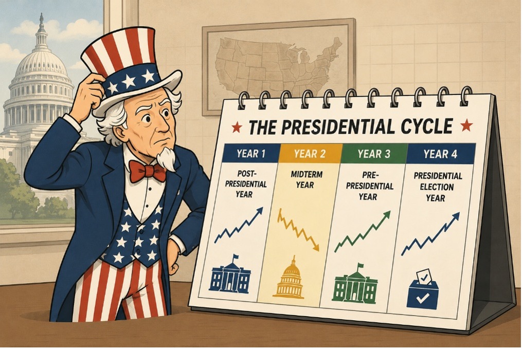
The US election cycle divides neatly into four-year types
- Year 1 — the post-presidential year, new administration in place
- Year 2 — the midterm year, congressional elections in November
- Year 3 — the pre-presidential year, the next cycle begins
- Year 4 — the presidential election year itself
Using Bloomberg data for the S&P 500 Composite (and predecessor indices) from 1928 through 2025, I grouped annual returns by year type. That's 97 years of market history, or roughly 24–25 observations for each stage of the cycle.
The Returns Don’t Seem Random
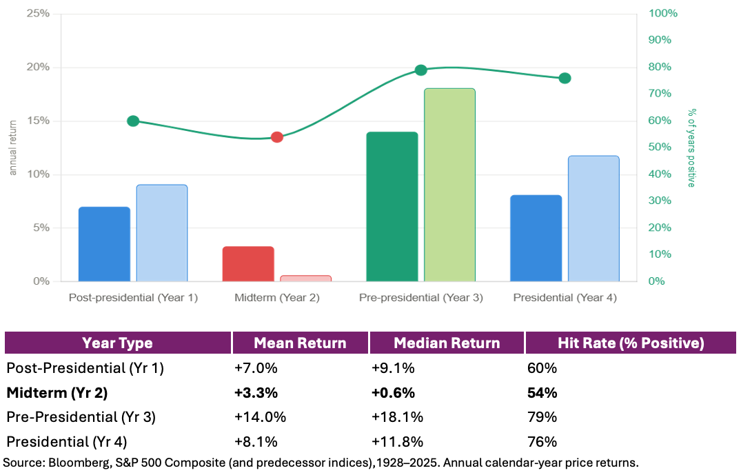
The pattern has a clear and consistent shape: at rough in Year 2, a peak in Year 3, and two middle-of-the-road bookends on either side. Before going any further, it's worth repeating that this isn't a market timing exercise. The evidence overwhelmingly supports staying invested, particularly for investors with a long-term horizon.
That said, the data is difficult to ignore. The median return during midterm years is just +0.6% — barely positive. Over nearly a century, investors were essentially flipping a coin on whether the year would finish up or down: 54% of the time it did, 46% of the time it didn't. Year 3tells a very different story. A 79% hit rate and an 18.1% median return standout immediately. If you could only own equities during one year of the four-year cycle, the historical data wouldn't make it a particularly difficult decision.
Again, we're not suggesting investors should time the market. We're simply pointing out what the data has shown.
It's Not Just the Return — It's the Risk You're Taking to Get It
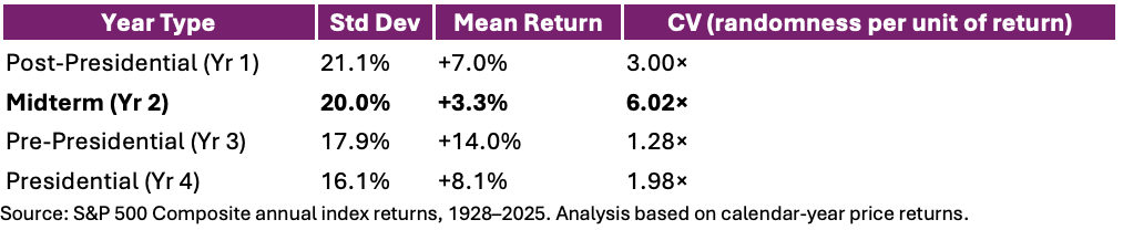
Here's where I started paying closer attention. The standard deviation of annual returns across year types is actually quite similar — ranging from 16% to 21%. Standard deviation here isn't measuring market volatility itself, but rather the dispersion of annual return outcomes. Those outcomes aren't dramatically different depending on where you are in the cycle.
What changes dramatically is the return you earn relative to that dispersion. The coefficient of variation (CV)— standard deviation divided by mean return — measures how much randomness in outcomes you're taking on per unit of expected return. A high CV means the noise swamps the signal. A low CV means the return is large enough that the uncertainty around it becomes almost secondary.
In a midterm year, the randomness in outcomes is roughly six times larger than the return you'd expect to earn. In a pre-presidential year, that ratio drops to just 1.3×. The uncertainty is similar. The compensation is not.
Think of it like being paid $1 to roll a die — six possible outcomes, one small payoff. Now imagine rolling that same die in a pre-presidential year, except this time you're being paid $6for the same roll. The die hasn't changed. The number of possible outcomes hasn't changed. But suddenly the randomness feels a lot more palatable because the compensation finally justifies it.
Where Midterms Actually Hurt
It's not just the weak average return — it's the shape of the distribution. Out of 24 midterm years in the dataset, 11 finished negative. That's a 45.8% negative rate — the highest of any year type and nearly triple the 16.7% rate observed during pre-presidential years.
The 10th percentile return for midterm years is-22%, worse than any other year type. And when midterms go wrong, they tend to go seriously wrong:
• 1930: -28.5%
• 1974: -29.7%
• 2002: -23.4%
• 2022: -19.4%
These losses aren't scattered randomly across the calendar. They cluster in Year 2.
By comparison, the negative pre-presidential years were far less severe. In 2011 (-0.03%) and 2015 (-0.73%), the market was essentially flat. The lone exception is 1931 (-47%), which was the GreatDepression doing what the Great Depression does. Remove that outlier and Year 3is remarkably clean across the full sample.
Why Might This Be Real?
I won't pretend to have a definitive explanation, but there are a few plausible theories. Midterm years often coincide with elevated policy uncertainty as markets try to assess the political landscape heading into congressional elections. As uncertainty rises, investors may demand a higher risk premium, which can weigh on valuations.
The flip side is what follows. Once the election result is known — regardless of which party wins — some of that uncertainty disappears. Markets gain clarity, risk premia can compress, and sentiment often improves. That doesn't prove causation, but it offers a reasonable explanation for why Year 3 has historically been the strongest part of the cycle.
Whether this is the true driver or not, The pattern has historically persisted across are markably diverse set of economic and political environments, including wars, recessions, inflation shocks, financial crises, and pandemics.
What I Take From This
I want to be clear about what this data is — and what it isn't.
It isn't a market timing signal. It isn't a reason to sit in cash every even-numbered year. I'm certainly not rotating out of equities every January of a midterm year. If anything, my bias has historically been the opposite. I'm generally optimistic when it comes to markets and, if you can fault me for anything, it's probably that I'm occasionally too bullish rather than too bearish. Nothing in this analysis changes that. Staying invested, staying disciplined, and maintaining a long-term horizon remains the right approach.
That said, investors aren't exactly short of things to think about today. AI-driven enthusiasm has pushed valuations higher in parts of the market, inflation could re-emerge if economic growth remains stronger than expected, and geopolitical tensions remain elevated. Whether any of these concerns ultimately matter remains to be seen, but they are reminders that uncertainty is never entirely absent from markets.
But a few things from this data are worth sitting with.
First, the consistency across nearly a century is harder to dismiss than most seasonal patterns. This isn't a 20-year sample that got cherry-picked — it spans depressions, wars, oil shocks, tech bubbles, financial crises, and pandemics.
Second, the risk-adjusted framing matters. The argument isn't that midterm years always lose money. It's that you earn dramatically less return for equivalent dispersion of outcomes, and the downside tail is meaningfully fatter. A 6× coefficient of variation is not a rounding error.
Third — and this is the part I find most interesting — the pattern isn't really about midterms at all. It's about Year3. The pre-presidential year is the genuine anomaly in this dataset. Midterm weakness is partly just the shadow cast by how strong the following year tends to be.
Where I think this becomes relevant is at the portfolio construction level. The lesson isn't that investors should try to sidestep midterm years, nor is it a reason to abandon growth-oriented investments. Growth remains an essential driver of long-term wealth creation, but it can be complemented by investments with more defensive characteristics.The objective isn't to eliminate risk — it's to build a portfolio that is resilient enough to remain fully invested through a wide range of market environments.
That strikes me as a sensible approach regardless of where we happen to be in the election cycle. The midterm data simply provides another reminder that balance matters.
Data: S&P 500 annual index returns,1928–2025. Analysis based on calendar-year price returns.
**Past performance is not indicative of future results.